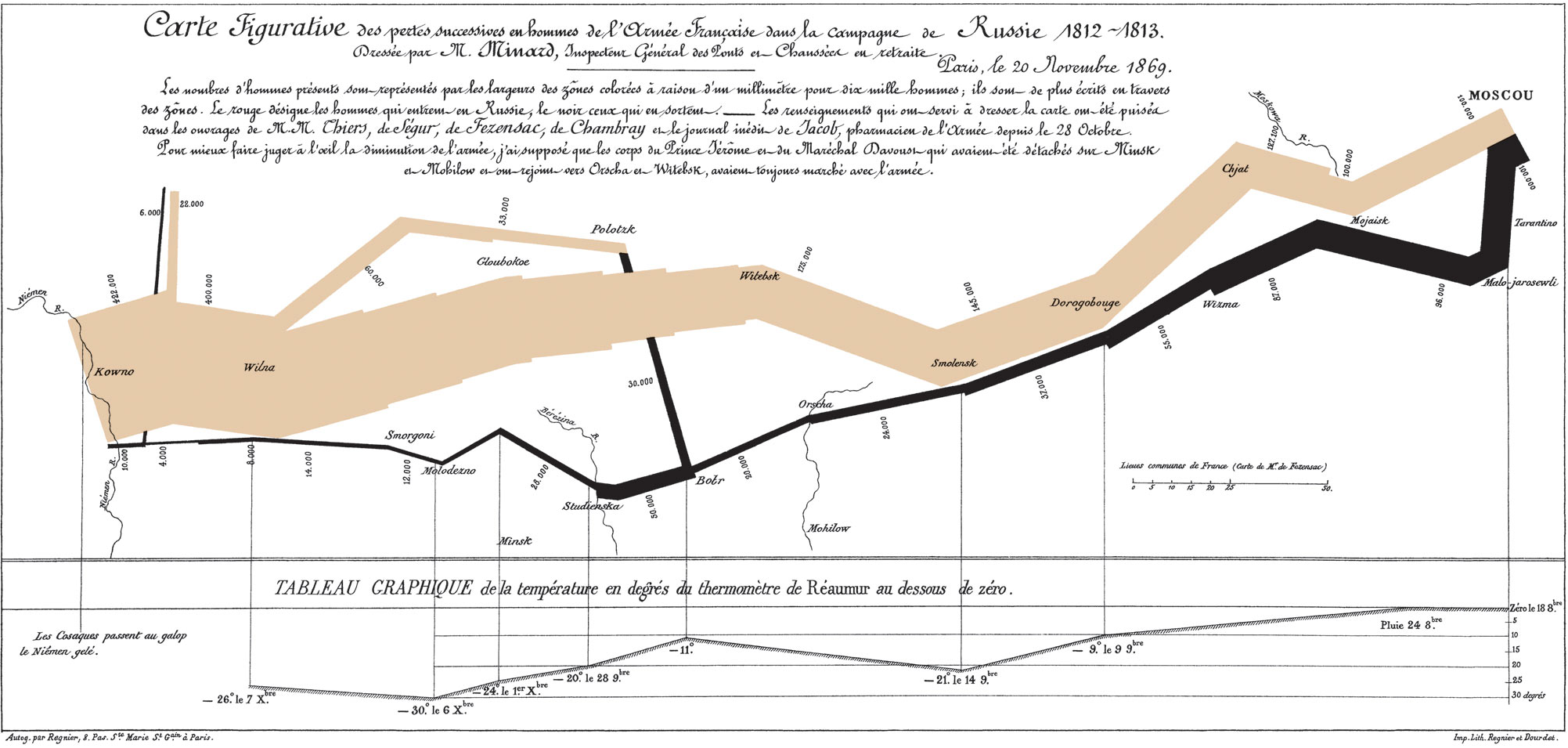
Every page on this site has the same image parallaxing gently in the background: Charles Minard's 1869 map of Napoleon's Russian campaign. I've never explained why. Edward Tufte called it possibly the best statistical graphic ever drawn, and I think that undersells it. It's opinion, not a benchmark, but it's an opinion I made before writing a word of this, since I picked the image first and I'm defending that choice now.
The map shows an army of roughly 422,000 soldiers marching into Russia in June 1812, reaching Moscow that September to find the city burned and abandoned, then retreating through a winter that destroyed what remained of it. Somewhere close to 10,000 men made it back out. Minard drew the entire campaign, forward and back, as one continuous image.
Six variables, no legend required to start reading it
What earns Tufte's claim isn't ornamentation. The map has almost none. It's how many real quantities it encodes at once, in a single flat image, without forcing a cross-reference to a legend before any of it means something:
- Army size, encoded as width. The tan (advancing) and black (retreating) bands are drawn with their width directly proportional to the number of living soldiers at that point. The band starts wide at the Polish border and narrows continuously as the campaign progresses. You see the army shrink in real time as your eye follows the line, with no number to look up.
- Geographic position, encoded as literal geography. The path is drawn against the actual rivers, towns, and terrain the army crossed, including the Berezina river crossing, where the retreat suffered some of its worst losses.
- Direction of travel, encoded as color. Tan for the advance toward Moscow, black for the retreat. One map covers both halves of the campaign.
- Temperature, encoded as a second chart sharing the same axis. Beneath the map, a line chart plots the temperature the retreating army faced, falling to around -30°R (roughly -37°C). It shares the same horizontal scale as the map above it, so a point on the retreat path lines up exactly with the temperature at that moment.
- Time, encoded along the same shared axis. Dates are marked directly on the retreat path, locking the army's position, size, and the temperature it faced to one timeline.
- Causation, implied by proximity rather than asserted by caption. Because the shrinking band and the falling temperature line share the same horizontal space, the relationship between cold and losses is something you notice by looking.
Six real variables, one image, and the only thing approaching a legend is a short note in the corner. None of it needs an interactive tooltip to be legible.
Why no legend needed is the real achievement
A lot of modern data visualization treats "add another dimension" as a reason to add another control: a dropdown, a toggle, a second chart the user has to notice and cross-reference. Minard didn't have that option in 1869, and the constraint produced something better. Every dimension had to earn its place directly in the image, encoded through position, width, or color instead of interactivity. The result is a chart you can screenshot, print in black and white, or glance at from across a room and still get the story from: a huge army went in, a tiny fraction came out, and the timing lines up with the worst cold.
A typical modern equivalent, a dashboard tracking a metric over time with a category breakdown, usually solves this with a dropdown filter or a set of small multiples. Both require the viewer to actively choose to look at the disaggregated view. Minard's map doesn't offer an aggregated view at all. There's no single "total casualties" figure anywhere on it that you could read off instead of the real story. The detailed version is the only version on offer.
Why this sits behind every page of this site
A separate post on this site covers Simpson's Paradox: a real 1986 clinical trial where a treatment wins every subgroup and still loses the aggregate, because the aggregate hides how unevenly the underlying groups were composed. That failure only works because the misleading simplified view and the honest detailed view are two separate charts, and nothing stops you stopping at the first one. Minard's map is the clearest counterexample I know of. There's no simplified, aggregated version of this chart sitting one click away to mistake for the whole story, because the detail is the chart. Using it as the literal background felt like the honest way to put that standard in front of every post on this site, including this one.
Where the comparison is unfair to modern tools
Minard's dataset was one campaign, a few thousand data points, hand-plotted once, never updated, never queried by a second user with a different question. Modern dashboards exist because most real datasets are none of those things: they're large, they change, and different viewers genuinely need different cuts of the same data. A static image that encodes six variables perfectly for one fixed question doesn't scale to "let me filter this by region and compare it to last quarter." Interactivity solves a real problem Minard's map doesn't face. The point isn't that dashboards are worse than this map; it's that adding a filter has made it too easy to treat "the user can drill down if they want to" as equivalent to "the honest view is the default," and the Simpson's Paradox post shows those aren't the same thing.
Caveats
"Best infographic ever" isn't a claim I can test the way a benchmark number gets tested elsewhere on this site, and visualization researchers reasonably nominate other candidates: John Snow's 1854 cholera map, Florence Nightingale's rose diagrams, and various modern data-journalism work all have serious cases made for them. I'm also not a neutral party. I chose this image as this site's background before writing a word of this post, so this is defending a decision already made, not discovering the map fresh.
Sources
- Minard, Charles Joseph. Carte figurative des pertes successives en hommes de l'Armée Française dans la campagne de Russie 1812-1813. 1869.
- Tufte, Edward. The Visual Display of Quantitative Information. Graphics Press, 1983.